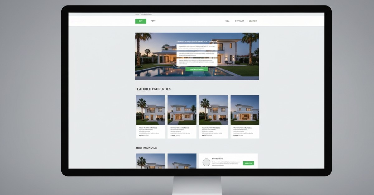

A mobile-friendly website is no longer optional, it is a must. In markets like Dubai and the UAE, users expect a fast, smooth, and visually clear experience on their phones. Search engines also give preference to websites that work well on mobile devices. If your site loads slowly, breaks on small screens, or feels hard to use, you lose customers and search visibility at the same time.
This checklist gives you a clear, simple roadmap to make your website easy to use, improve your mobile-friendly website, and offer a cleaner user experience overall.
What Is a Mobile-Friendly Website?
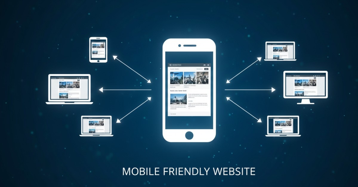
A mobile-friendly website adjusts its layout, structure, and content to work smoothly on smartphones and tablets. The design responds to different screen sizes, keeping the experience clean and easy to navigate.
A mobile-friendly website usually includes:
- Responsive design that adapts automatically.
- Text that is easy to read without unnecessary zooming.
- Buttons and menus that work well on touch screens.
- Lightweight pages that load fast on mobile data.
- Clean, simple layouts that reduce clutter.
Google checks these factors closely when ranking websites on mobile search results.
Why Mobile Friendliness Is Important for SEO
In Dubai’s high-speed economy, 5G is the standard. If your website feels sluggish on a 5G connection, users perceive your brand as outdated. Mobile-friendly SEO isn’t just about Google, it’s about matching the lifestyle of your premium UAE audience.
Here is a list of reasons why mobile friendliness is Important for SEO:
- Google uses mobile-first indexing
Google primarily crawls the mobile version of your website. If the mobile version is slow or broken, rankings will drop even if your desktop version looks perfect. - Mobile users dominate search traffic
Over 60 to 70% of web searches in the UAE come from mobile devices. Your site must meet user expectations. - Bounce rate increases with slow load time
If a page takes longer than 3 to 5 seconds to load, most mobile users leave the website altogether. This will hurt your SEO performance and overall ranking. - Better UX means better rankings
Search engines reward websites with smooth navigation, readable text, and clear layouts.
Mobile-friendly websites consistently perform better in organic traffic, engagement, conversions, and long-term SEO growth.
12 Points to Include in Your Checklist for a Mobile-Friendly Website
This checklist combines insights from UX standards, Google’s guidelines, and high-performing sites across the UAE market.
1. Use a Fully Responsive Design
Your website should automatically adjust to devices like mobile and tablets. A fluid grid layout keeps spacing, images, and text comfortable on small screens.
2. Improve Page Speed
Use caching, reduce JavaScript, and remove unused plugins. Google PageSpeed Insights can guide your improvements.
3. Fix Text Size and Readability
Use clear font sizes that don’t require zooming. Most mobile websites use 16px as a comfortable base size.
4. Optimize Images for Mobile
Large images slow down mobile pages. Compress them and use WebP formats to keep quality high and load time low. Images must be less than 100 KB.
5. Keep CTA Easy to Tap
Touch-friendly buttons reduce misclicks and improve navigation. Add spacing around CTAs for a smoother experience.
6. Simplify Your Navigation Menu
Mobile users prefer short menus. Reduce layers, add icons, and keep essentials easy to reach.
7. Use Clean, Clear Layouts
Avoid clutter on mobile screens. Focus on essential content and keep spacing generous.
8. Avoid Pop-ups That Block Content
Intrusive pop-ups hurt SEO and frustrate mobile visitors. Use small banners instead.
9. Test Your Mobile-Friendly Status
Use Google’s Mobile-Friendly Test tool to check performance and fix issues.
10. Align Desktop and Mobile Content
Google expects your mobile content to match your desktop content for proper indexing.
11. Improve Mobile Formats
Make fields easy to type on small screens. Use large inputs and auto-fill where possible.
12. Use a CDN for Faster Delivery
A content delivery network speeds up load time for visitors across the UAE and the Middle East.
Did you know? > 53% of mobile visits are abandoned if a page takes longer than 3 seconds to load. If you haven’t optimized your images or simplified your navigation, you are handing your customers to your competitors on a silver platter.
Case Study: UAE E-Commerce Brand Improves Mobile Conversions
One Dubai-based retailer reported the following after optimizing for mobile:
- Page load time dropped from 5.8s to 1.9s
- Bounce rate decreased by 32%
- Mobile conversions increased by 21%
- Organic visibility improved within three months
Most gains came from faster speed, compressed images, and a simplified mobile navigation setup.
Don’t Let a Broken Mobile Experience Kill Your Growth
Your website is your #1 salesperson in Dubai. If it doesn’t work perfectly on a smartphone, your sales funnel is leaking. At Zera Creative, we specialize in turning slow, desktop-heavy sites into high-converting, seo mobile-friendly machines.
Talk to a Mobile SEO Expert on WhatsApp.
FAQs
1. What Are Mobile Friendly Websites?
A: A mobile-friendly website is like a smaller version your your own website, but it is easy to use on mobile phones.
2. How Mobile-Friendly Is My Website?
A: Google’s Mobile-Friendly Test: This is a free tool provided by Google that allows you to enter a URL and receive a report on the mobile-friendliness of a website. It checks for common mobile-friendliness issues such as text size, viewport settings, and touch elements.
3. How to Check if a Website Is Mobile-Friendly?
A: Google’s Mobile-Friendly Test: This is a free tool provided by Google that allows you to enter a URL and receive a report on the mobile-friendliness of a website.
4. What Are the Key Details to Remember About Mobile Websites?
A: Good mobile website design should put the user first. It should be easy to navigate and intuitive to use.